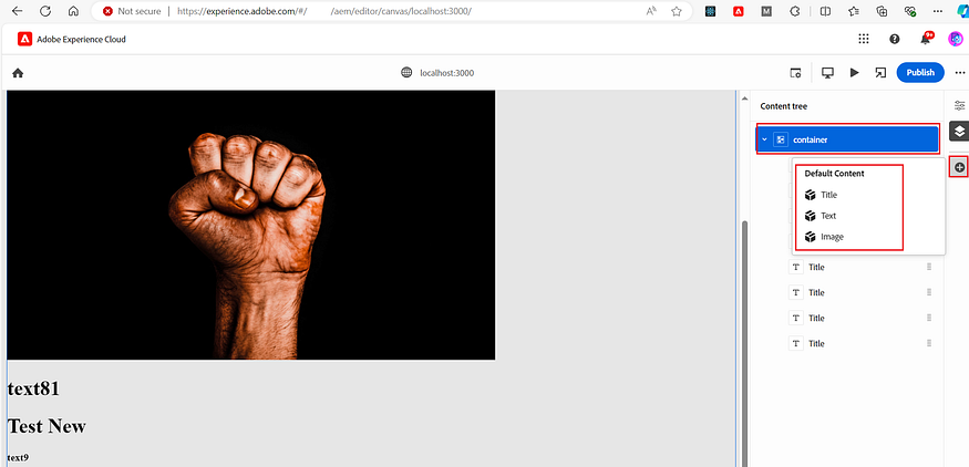
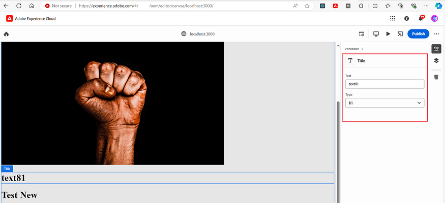
In my previous post AEM Universal Visual Editor: Easily Author AEM Content Anywhere with In-Context Editing (Part 1) | by Albin Issac | Tech Learnings | Jun, 2024 | Medium, we discussed the basics of the AEM Universal Visual Editor and how to use it to support both headless and headful content authoring. In this post, let’s review how to enable a component/container-based approach to drag and drop components from the property rail, as well as how to rearrange components, and more.
Components/Container:
Parts of the DOM can be marked as a container for other components or as individual components that are movable and deletable within the container.
data-aue-type
In our Part 1 post, we saw different data-aue-type values. Here are additional values to mark the DOM as a Container/Component:
- container: The editable behaves as a container for components, also known as a Paragraph System.
- component: The editable is a component. It doesn’t add additional functionality but is required to indicate movable/deletable parts of the DOM and to open the properties rail and its fields.
data-aue-behavior
- component: Used to allow standalone text, rich text, and media to mimic components so they are also movable and deletable on the page. This also allows containers to be treated as their own components, making them movable and deletable on the page.
In the example below, the div is marked with data-aue-type="richtext", so it will act like a rich text editor for the property rail or inline editing. The attribute data-aue-behavior="component" marks this as a component and allows the moving and deleting of this div.
 <div
      dangerouslySetInnerHTML={data.text ? { __html: data.text } : null}
      data-aue-resource={`urn:aemconnection:${path}`}
      id={data.id}
      data-aue-type="richtext"
      data-aue-prop="text"
      data-aue-label="Rich Text"
      data-aue-behavior="component"
    />
In the example below, the div is marked with data-aue-type="container", so it will act as a container for other components. The attribute data-aue-behavior="component" marks this div itself as a component and allows it to be moved and deleted.
<div
      data-aue-type="container"
      data-aue-behavior="component"
       data-aue-resource={`urn:aemconnection:${BASE_CONTAINER_PATH}`}
      data-aue-filter="container-filter"
    >
I am maintaining a page /content/sites/test in AEM that has a container /content/sites/test/jcr:content/root/container/container with some child components. I am rendering that container along with the child components in my headless application. Here is the complete App.js for reference:
import React, { useEffect, useState } from "react";

// Function to fetch the JSON data for a given path
async function fetchData(path) {
  const response = await fetch(path);
  const data = await response.json();
  return data;
}

// Base path for container
const BASE_CONTAINER_PATH = "/content/sites/test/jcr:content/root/container/container";

// Component to render text content
const TitleComponent = ({ data, itemKey }) => {
  const TitleTag = data.type || "h2";
  const path = `${BASE_CONTAINER_PATH}/${itemKey}`;
  return (
    <TitleTag
      dangerouslySetInnerHTML={data.text ? { __html: data.text } : null}
      data-aue-resource={`urn:aemconnection:${path}`}
      data-aue-type="text"
      id={data.id}
      data-aue-prop="jcr:title"
      data-aue-label="Title"
      data-aue-model="title"
      data-aue-behavior="component"
    />
  );
};

// Component to render rich text content
const TextComponent = ({ data, itemKey }) => {
  const path = `${BASE_CONTAINER_PATH}/${itemKey}`;
  return (
    <div
      dangerouslySetInnerHTML={data.text ? { __html: data.text } : null}
      data-aue-resource={`urn:aemconnection:${path}`}
      id={data.id}
      data-aue-type="richtext"
      data-aue-prop="text"
      data-aue-label="Rich Text"
      data-aue-behavior="component"
    />
  );
};

// Component to render image content
const ImageComponent = ({ data, itemKey }) => {
  const path = `${BASE_CONTAINER_PATH}/${itemKey}`;
  return (
    <img
      src={data.src}
      id={data.id}
      alt={data.alt}
      srcSet={data.srcset}
      data-aue-resource={`urn:aemconnection:${path}`}
      data-aue-type="media"
      data-aue-prop="fileReference"
      data-aue-label="Image"
      data-aue-model="image"
      data-aue-behavior="component"
    />
  );
};

// Map of aem component types to React components
const componentMap = {
  "test/components/core/title": TitleComponent,
  "test/components/core/text": TextComponent,
  "test/components/core/image": ImageComponent,
  // Add more mappings here as needed
};

// Component to render a dynamic component based on its type
const DynamicComponent = ({ data, itemKey }) => {
  if (!data || !data[":type"]) return null;

  const Component = componentMap[data[":type"]];
  if (!Component) {
    console.error(`No component found for type: ${data[":type"]}`);
    return null;
  }

  return <Component data={data} itemKey={itemKey} />;
};

// Container component to allow drag-and-drop functionality
const Container = ({ data }) => {
  return (
    <div
      data-aue-type="container"
      data-aue-resource={`urn:aemconnection:${BASE_CONTAINER_PATH}`}
      data-aue-filter="container-filter"
    >
      {data[":itemsOrder"] &&
        data[":itemsOrder"].map((itemKey) => {
          const child = data[":items"][itemKey];
          return <DynamicComponent key={child.id} data={child} itemKey={itemKey} />;
        })}
    </div>
  );
};

// Main App component
const App = () => {
  const [containerData, setContainerData] = useState(null);
  const [error, setError] = useState(null);

  useEffect(() => {
    async function fetchContainerData() {
      try {
        const data = await fetchData(
          "/content/sites/test/jcr:content/root/container/container.model.json"
        );
        setContainerData(data);
      } catch (err) {
        setError("Failed to fetch container data");
      }
    }

    fetchContainerData();
  }, []);

  if (error) {
    return <div>Error: {error}</div>;
  }

  if (!containerData) {
    return <div>Loading...</div>;
  }

  return (
    <div>
      <h1>Dynamic Container</h1>
      <Container data={containerData} />
    </div>
  );
};

export default App;
Now the container and the child components are displayed in the order defined on the AEM page. The components can be deleted and rearranged within the container, and any content updates are persisted back to the AEM page.


Still, we will not be able to add new components to the container or customize the property rail for component authoring. The current property rail is the default one based on the defined data-aue-type.
Component Model/Definition/Filters:
To enable component addition and custom editing views on the property rail for components, we need to define component models, definitions, and filters. These can be defined inline on the page or in external files within the website. I am going to define them through external files.
- component-models.json: Defines the model to edit the component on the property rail. You can use multiple component types to display the authoring view for the component. Refer to Model Definitions, Fields, and Component Types | Adobe Experience Manager for more details. I am not defining custom fields for the text component and am using the out-of-the-box (OOTB) field for authoring the content.
[
  {
    "id": "title",
    "fields": [
      {
        "component": "text",
        "valueType": "string",
        "name": "jcr:title",
        "value": "",
        "label": "Text"
      },
      {
        "component": "select",
        "name": "type",
        "value": "h1",
        "label": "Type",
        "valueType": "string",
        "options": [
          {
            "name": "h1",
            "value": "h1"
          },
          {
            "name": "h2",
            "value": "h2"
          },
          {
            "name": "h3",
            "value": "h3"
          },
          {
            "name": "h4",
            "value": "h4"
          },
          {
            "name": "h5",
            "value": "h5"
          },
          {
            "name": "h6",
            "value": "h6"
          }
        ]
      }
    ]
  },
  {
    "id": "image",
    "fields": [
     {
        "component": "text",
        "valueType": "string",
        "name": "alt",
        "value": "Default alt",
        "label": "Alt Text"
      }
    ]
  }
]- component-definition.json: Groups the components under different categories and maps the components to AEM resource types or other content sources.
{
  "groups": [
    {
      "title": "Default Content",
      "id": "default",
      "components": [
        {
          "title": "Title",
          "id": "title",
          "plugins": {
            "aem": {
              "page": {
                "resourceType": "test/components/core/title",
                "template": {}
              }
            }
          }
        },
  {
          "title": "Text",
          "id": "text",
          "plugins": {
            "aem": {
              "page": {
                "resourceType": "test/components/core/text",
                "template": {}
              }
            }
          }
        },
  {
          "title": "Image",
          "id": "image",
          "plugins": {
            "aem": {
              "page": {
                "resourceType": "test/components/core/image",
                "template": {}
              }
            }
          }
        }
      ]
    }
  ]
}- component-filters.json: Defines component filters for different containers, allowing specific components in specific containers.
[
  {
    "id": "container-filter",
     "components": ["title","text","image"]
   }
]
I stored these files under the static folder in the public folder of my React app. Now, add the following lines to the head section of the index.html file:
<script type="application/vnd.adobe.aue.component+json" src="%PUBLIC_URL%/static/component-definition.json"></script>
<script type="application/vnd.adobe.aue.model+json" src="%PUBLIC_URL%/static/component-models.json"></script>
<script type="application/vnd.adobe.aue.filter+json" src="%PUBLIC_URL%/static/component-filters.json"></script>
Now, associate the model for the DIVs and also associate the filter for the containers (refer to the App.js shared above).
<TitleTag
      dangerouslySetInnerHTML={data.text ? { __html: data.text } : null}
      data-aue-resource={`urn:aemconnection:${path}`}
      data-aue-type="text"
   id={data.id}
      data-aue-prop="jcr:title"
      data-aue-label="Title"
      data-aue-model="title"
      data-aue-behavior="component"
    />
<img
src={data.src}
id={data.id}
alt={data.alt}
srcSet={data.srcset}
data-aue-resource={`urn:aemconnection:${path}`}
data-aue-type="media"
data-aue-prop="fileReference"
data-aue-label="Image"
data-aue-model="image"
data-aue-behavior="component"
/> <div
data-aue-type="container"
data-aue-resource={`urn:aemconnection:${BASE_CONTAINER_PATH}`}
data-aue-filter="container-filter"
>Now you will be able to add new components under the container also able to edit the component with the model defined.


In this post, we discuss how to maintain and render a container with child components from an AEM page in a headless application. We outline the steps to define and associate models, definitions, and filters for components to enable custom editing views and component management using the Universal Editor. This includes adding components to the container and rearranging the components within the container. We will delve deeper into the use cases of the Universal Editor in upcoming posts.
The same approach can be applied for editing AEM pages based on Core components. As discussed in the previous post, the current version of Core components does not support the Universal Editor out-of-the-box, but we hope that future versions will include the necessary AEM changes to support the Universal Editor for editing pages based on Core components.
I have a question and it will make my day if you can answer me, please.
ReplyDeleteHow can we add multifield? I mean, I want to be able to add social icons that contains a text near the icon, so I will have an input for image, and one for text. But I want a multifield button " + " each time I press the addition button, It should appear another multifield that requires the image (icon) and the text. How we do that? Thank you